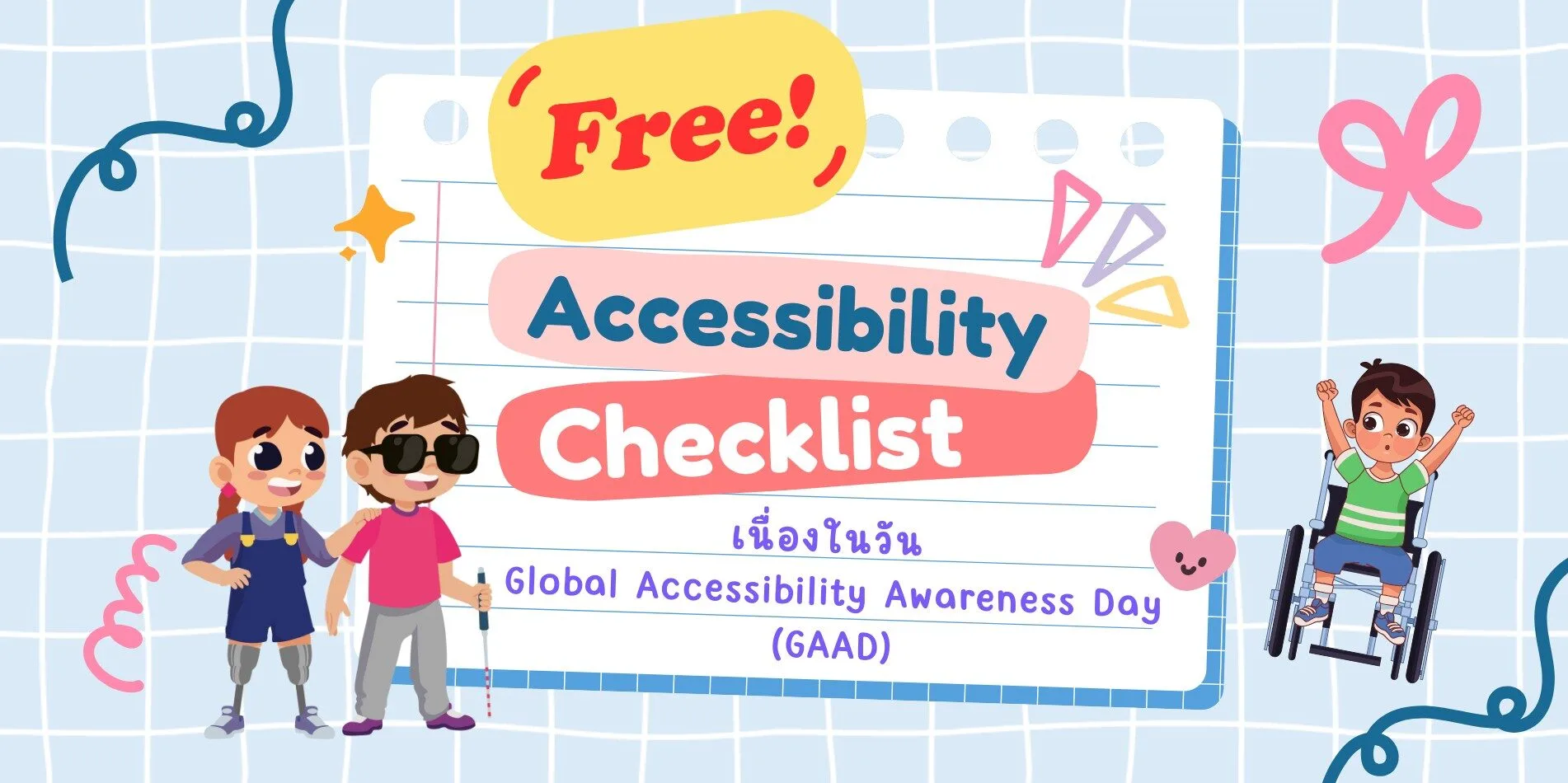
On Global Accessibility Awareness Day (GAAD), let's rethink how we design for everyone. Global Accessibility Awareness Day (GAAD)
In today’s fast-paced digital world, technology reaches every part of our lives. Many of us assume that everyone has equal access to the information and services online.
But in reality, many people—especially persons with disabilities—still face barriers to accessing digital content, websites, applications, and online platforms.
“Global Accessibility Awareness Day (GAAD)” or วันตระหนักรู้ด้านการเข้าถึงระดับโลก serves as a crucial reminder to ask ourselves:
🧱 The Barriers We Don't See
Here are a few real-world examples
- • Buttons that are too small for users with limited mobility
- • Videos without captions for people who are Deaf or hard of hearing
- • Infographics without text alternatives for users who are blind or visually impaired
These barriers often happen unintentionally, yet they can have a significant impact on someone's ability to engage with the world online.
🟣 Vulcan Coalition’s Commitment: No One Left Behind
At Vulcan Coalition, we work with people with disabilities across a variety of roles—from technology to design, communication to service.
We believe that the digital world should be a space where everyone can reach their full potential, regardless of how they access it. That’s why we’re committed to creating content and platforms that embrace user diversity at every step.
✅ A Tool for Change: Thai Accessibility Checklist
To support more equitable and inclusive digital communication and design, our team has created a Thai-language Accessibility Checklist a practical guide for reviewing and improving content across all formats.
This checklist includes 7 core areas, each with examples and reasons for implementation:
1. Clear Language & Inclusive Content
| What to Check | Why It Matters |
| Use simple, easy-to-understand language | Makes content accessible regardless of education level |
| Avoid biased terms like “normal”, “whole”, or “patient” | Prevents exclusion and reinforces dignity |
| Explain technical terms when first introduced | Not all users are familiar with terms like “AI”, “UX”, or “CTA” |
| Avoid acronyms or slang without definitions | Ensures clarity for all audiences |
2. Images & Visuals
| What to Check | Why It Matters |
| Add alt text to all meaningful images | Helps screen reader users understand visual content |
| Don’t embed important text in images only | Text in images can’t be accessed by many assistive tools |
| Use high-contrast colors (WCAG AA) | Improves readability for low-vision users |
| Don’t rely on color alone to convey meaning | Supports users with color blindness |
3. Video & Audio
| What to Check | Why It Matters |
| Provide accurate subtitles or captions | Enables Deaf or hard-of-hearing users to access content |
| Include audio descriptions for key visuals | Helps blind or visually impaired users understand visual context |
| Avoid loud background music or fast-paced speech | Supports users with auditory processing difficulties |
| Avoid flashing content over 3 times per second | Prevents seizures in photosensitive users |
4. Social Media & Post Content
| What to Check | Why It Matters |
| Provide descriptions for images or infographics | Ensures users who can’t see images still get the message |
| Avoid rapidly flashing GIFs or animations | Prevents sensory overload or health risks |
| Use CamelCase or spaced hashtags (#AccessibleDesign) | Makes hashtags readable by screen readers |
| Avoid using emojis to replace words | Screen readers may misinterpret or skip them |
5. Documents & Presentation
| What to Check | Why It Matters |
| Use clear heading structure (H1–H3) | Helps screen readers navigate content efficiently |
| Use easy-to-read fonts (e.g., Noto Sans, Sarabun) | Reduces eye strain and improves clarity |
| Avoid justified text alignment | Uneven spacing can disrupt readability, especially for dyslexia |
| Ensure PDFs are selectable (not image-only) | Allows screen readers to access text content |
6. Interaction & Navigation
| What to Check | Why It Matters |
| Buttons/links are at least 44x44 pixels | Ensures usability for people with limited dexterity |
| Entire interface is navigable via keyboard only | Supports users who can’t use a mouse |
| Include visible focus indicators | Shows keyboard users where they are on the screen |
| Label form fields clearly and provide helpful error messages | Reduces confusion, especially for users with cognitive differences |
| Avoid auto timeouts without warnings or controls | Allows users to complete tasks at their own pace |
7. Testing & Continuous Improvement
| What to Check | Why It Matters |
| Test with real users, including people with disabilities | Provides practical insight into real-world usability |
| Use tools like WAVE, axe, or Lighthouse | Detects issues that might otherwise be overlooked |
| Provide feedback channels for accessibility | Encourages improvement based on user experience |
🌍 Change Starts with Intention
Accessible design isn’t just about convenience for people with disabilities. It’s about making content better for everyone—clearer, more usable, more thoughtful. On this Global Accessibility Awareness Day .
Vulcan Coalition invites you to help make Accessibility the standard, not just an option.
#GAAD2025 #AccessibilityChecklist #InclusiveDesign #VulcanCoalition
#DigitalInclusion #NoOneLeftBehind
